Why I created Renewed Tab
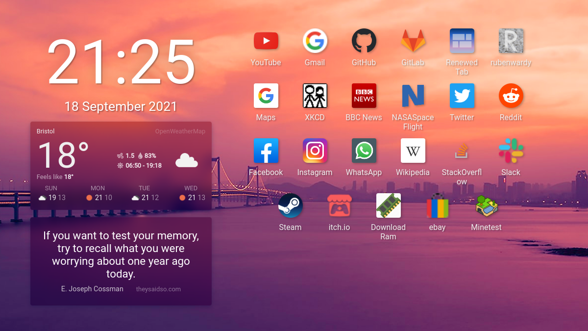
2 min read (497 words)I created Renewed Tab last year to fulfil my personal needs, and have since expanded on it based on user feedback, focusing on rich widgets, a clean user experience, and customisation. In this article, I will explain what exactly led me to create a New Tab extension and what the design requirements were.
Momentum
For a long time, I used the Momentum browser extension. Opening your browser to a pretty background image was nice; there were quite interesting images to look at. However, I was disappointed by the lack of options or widgets, and the fact that basic features like background colours were locked behind a paywall. The extension also required an account and sent all the configuration data into the cloud.
After I missed a few space launches, I wanted a widget to keep track of when they were happening. I also wanted a simple feed widget, to keep up to date with the news and various websites.
Looking for alternatives: Tabliss
I checked out quite a few alternatives but wasn’t able to find what I wanted. They either had a bad user experience, none of the features I wanted, or they locked basic features behind a paywall.
The closest I found to what I wanted was Tabliss. It was open-source, looked good, and offered a widget system. However, I found the placement system quite annoying to use - it was based on anchors, and it was very easy to end up with overlapping widgets. It also didn’t support RSS/Atom feeds and had quite a few bugs.
Renewed Tab
User experience and customisability are the two primary goals of Renewed Tab.
I’m a big fan of user experience and creating something that feels simple but offers great potential. Rather than an anchor system or complex configuration GUIs, I wanted a way to drag and drop widgets around on the screen. Users are used to moving and resizing objects using their mouse, so I felt like this would be a better approach.
Back in the 2000s, I used iGoogle. You could create gadgets and configure them individually. Whilst I didn’t realise it at the time, this was quite a big influence on the design of Renewed Tab. The first version of the extension used “masonry” columns, just like iGoogle, where widgets were stacked on top of each other. One cool feature that iGoogle had was an API for third-party developers to make their own widgets. This is something I’d like to support in Renewed Tab, but is difficult due to browser extension store policies.
Conclusion
I created Renewed Tab because I wasn’t happy with the existing options, and had an idea of how to make the process more user-friendly.
I plan to continue developing Renewed Tab, to build on its solid foundation without losing touch with the original goals. Interested in what’s coming next? Development is done publicly on GitLab, with the roadmap fully visible.